Valley Life Sciences Building
University of California, Berkeley
Floor plans, Spring 2013
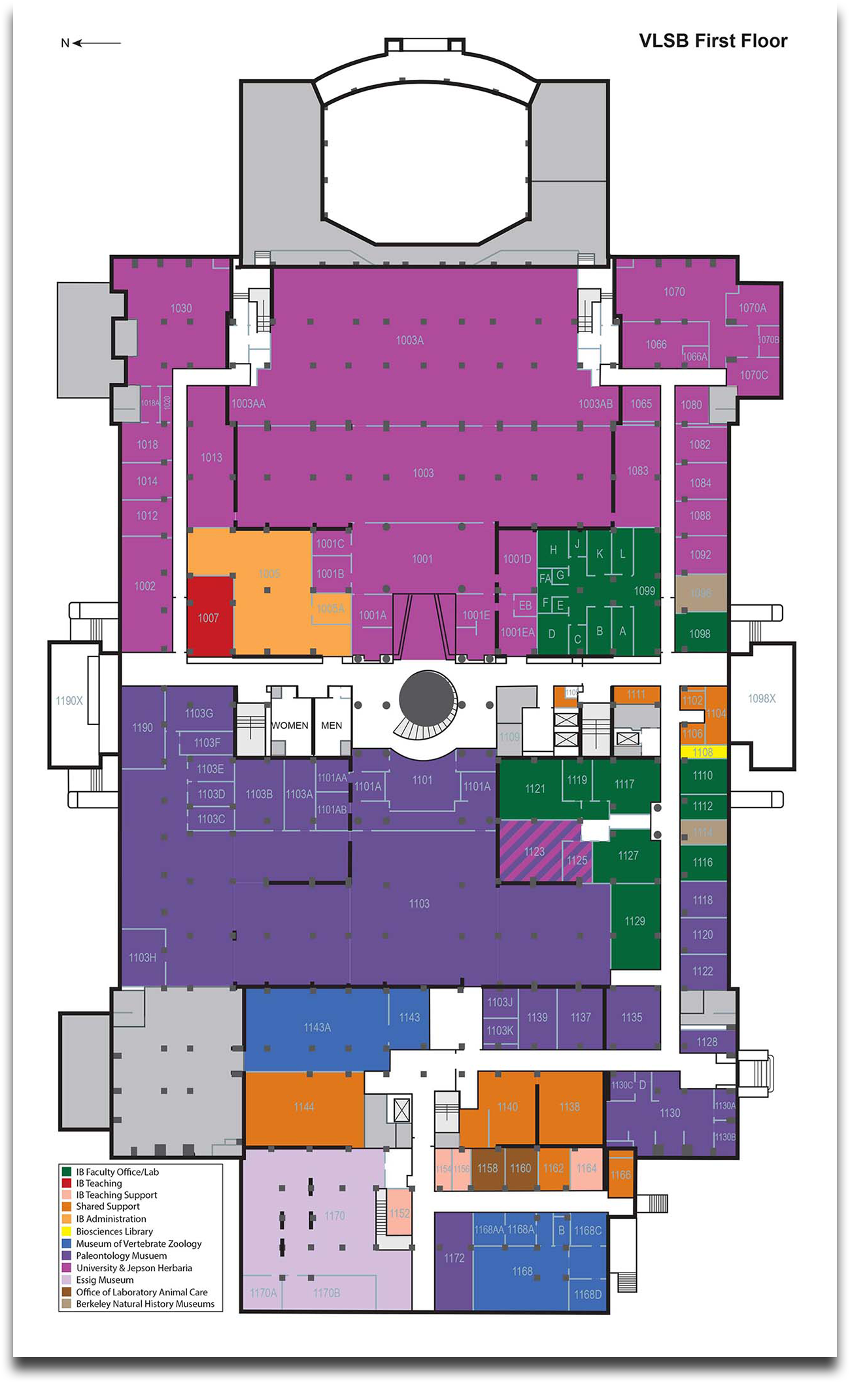
I created this floor plan in Illustrator, using layers to represent the different parts of the building and the assigned usage of the space.
I was asked to make an updated floor plan of the building (six floors) with color-coding to denote the different
uses of the space. As source material, I was presented with Photoshop files that had been created by another
artist. The underlying floor plans in these illustrations appeared to have been sent via a fax machine at some
point, leaving them with illegible room numbers and warped lines. In addition, none of the six floors had been
initially drawn to the the same proportions, which led to inconsistencies such as support columns being located
in a different place on every floor, and elevators that did not line up vertically. I used the two most similar
floor plans to arrive at a consistent layout (with outside walls, stairways, elevators, and support columns
lined up on each floor), and spent some time walking around inside the building, noting missing room numbers
and distinctive elements of each floor.
After the underlying floor plans were complete, I designed a color chart to accommodate all the different uses
of space in the building, with similar units assigned colors in the same family. In the example shown here,
you can see that teaching space is red, administration is orange, and museum collections are blue and purple.


